Monday 27 May 2013

I'm Freeeeeeee


My family have recently bought a caravan down Aberporth in West Wales and the coastline is absolutely beautiful. Since finishing university i'm finally free to paint what i want and it feels brilliant. Whilst this piece is very much in the mold of old Max, the things i've learnt over the last year is evident.


Exhibition space all up and running ready for marking and viewing.


I think the triptych works well as the culmination of my years work as it balances out all of the styles and techniques i have learnt and used over the year, whilst containing segments of my natural detailed style. I added flashes of red throughout the 3 paintings the counteract the all out blue.


 I felt unsatisfied with my Millennium Stadium painting as a centrepiece, i felt i needed another piece to work alongside it. The design started out as a singular work designed to be tall and imposing but i felt a triptych of paintings collectively of similar size to the Millennium would mirror the painting well.


This painting came about after the discovery of the artist Claude Parent. His conceptual architecture set against a vast empty landscape gives off a very strange vibe. I tried to get the same effect through my painting, with the obscure structure striking out of the surrounding mist and cloud.
 I felt the fire didn't glow enough to really stand out against the blue of the sky. I repainted the area with white and then again with reds and oranges to brighten the colour. Still not content i glazed blues across the sky to reduce it's glow and the fire began to jump out of the canvas.


 Further detail was added to the break in the cloud, suggestions of moonlight creeping in. Adding the reddy orange glow of a fire emerges. The struts of a building begin to take shape around the fire. As the glow is reworked it starts to take centre stage of the painting.
 The reds of the fire and the shine of the moonlight work perfectly to pick out the spires of the Millennium Stadium yet the darkness of the clouds behind swallow much of the form to make them purposefully hard to work out.

This large scale painting was to be the centrepiece of my exhibition. I began it like many of my works before, by applying lashes of paint, in this case phthalo blue and cadmium red deep hue. This mix was reapplied to darken the tone of piece, with details added to the clouds.


 The style of these two was one i stumbled upon accidentally but turned out great. The piece above was originally a scene of mist floating through ruinous skyscrapers but it just didn't seem to work, as i went to wipe it away with an old dried up brush the city suddenly became a tempest. With the addition of the reds and oranges suggesting someone taking shelter in an old bus, the painting really came into it's own.
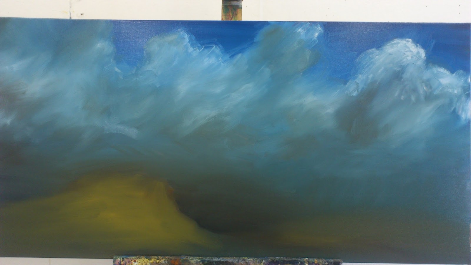
I carried this style on into the next work and, coupled with the areas of detail, the brush marks gave the piece a really sense of movement.


An old ruined farmhouse down in Aberporth was the source of this work, although i doesn't fit directly in with my other work it still bares relevance and was useful to see and paint the natural decay of the structure.

Possibly one of my favourite paintings this year, a response to the images i had gathered of the destruction in Beirut. What i love about this piece is the balance between the old Max and the new, i've mixed the free flowing style that has become second nature to me with the old instinctual details of my past years.


At this point i began to look into actual ruined structures 
for source material as much of my paintings had come off
the top of my head. These images are of the destruction
in Beirut, it's a sobering reminder that as i'm painting these 
fictional scenarios there are places in the world where 
people are living and suffering with these problems every
day. It's frightening that man can still do this to another 
man in this day and age.


With this painting I tried to narrow the light and use the height of the board to convey a feeling of closeness and smallness. Whilst this may not be one of my better pieces i think it captures the tension i was looking for.
Another look into the sublime through the use of colour, this time inspired by the works of Mark Rothko. Although almost completely unidentifiable to the works of the John Martin and Caspar David Friedrich, the same principal of colour and light lies within the Romanticists works. Rothko's use of glaring colours paired with darker counterparts would create a sense of awe and eeriness in the viewer. It might also help that they're usually gigantic pieces as opposed to my small scale canvas, though i think the idea still comes across well.
Whilst i was becoming quite content with the style of painting i was building up i felt i still needed to explore other avenues of art in search of anything that might enhance my work further. This piece was a shot at trying to create an eerie feel through a surrealistic style. I think the Edvard Munch-esque sky coupled with the towering structure work in giving of a weird sense but it's not quite the look i'm after for my final body of work.

The strongest influence upon my works is not an artist but the very atmosphere that surrounds us. Wherever i go i always find myself staring up at the sky, snapping photos left right and centre once the sky has caught my interest.


Although this is possibly my least favourite of all the works i've created this year, but due to my phones decision to delete 90% of my photos, it's one of the most documented from a process point of view. The stages this painting went through don't reflect on most of the pieces i've created this year. Whereas i would make a base layer of an abstract mix of various colours normally, when i know i've painting a blue sky i apply a layer of burnt sienna so it resonates warmth through the blue.
This small piece has become one of my favourite paintings. The suggestiveness and style has a really appeal about it though the i have had trouble trying to replicate the style onto other works which is a real shame.
One of the main ideas i was playing around with in my work this year was the sublime. The sublime being that feeling of awe you get from something that is either extremely beautiful or terrifying. Artists like John Martin and Caspar David Friedrich would often explore this idea within there works. Whilst my painting may  give of a resonance of beauty the scene itself is one of horror and destruction. A fair few people have mistaken this piece for a sunset whereas in actual fact it's supposed to be a nuclear blast and ruins of what once was. If you look closely at it you can pick out the straight and hard edges of man-made objects.